Creativebrief’s header redesign
Creativebrief’s header navigation serves as the digital welcome mat for visitors across various industries, including marketers, agency teams, and freelance creatives. The project was simple: refine the desktop and mobile header navigation to align with industry best practices, while reinforcing Creativebrief’s brand identity and making navigation simple, intuitive, and accessible to showcase their marketing consultancy service and insights product portal..

Old website navigation with inconsistent UI & UX.
Goals
Simplicity & clarity: Users should immediately understand where each link leads—no guesswork.
Intuitive navigation: Clear visual hierarchy and predictable interactions, across desktop and mobile.
Accessibility: Large tap targets, high-contrast text, and a clear structure for screen readers.
Consistency: A unified experience across devices, reinforcing brand familiarity.
Enhanced brand perception: A polished and usable header builds trust and conveys professionalism.
Improved engagement: Efficient navigation boosts page views, session duration, and conversion opportunities.
Scalability: A flexible header system that supports future products, services, and features—search, user profiles, CTAs—without bloating the UI.
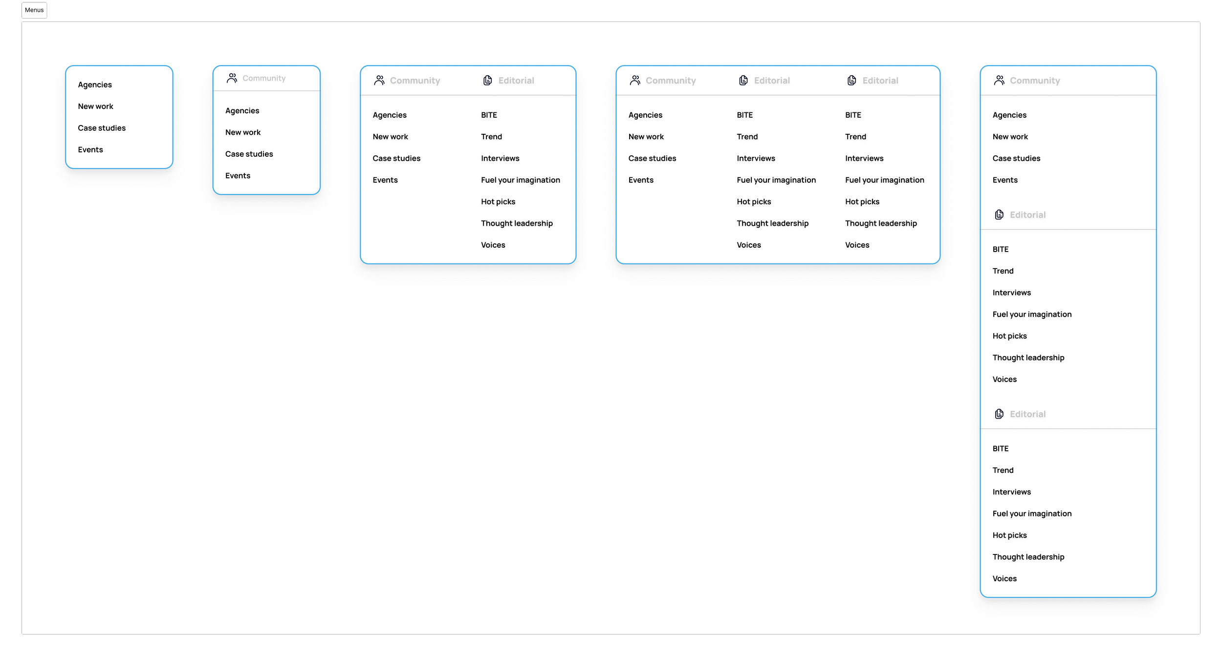
Updated header UI & UX
Desktop
Logged out

Logged in (Gated)

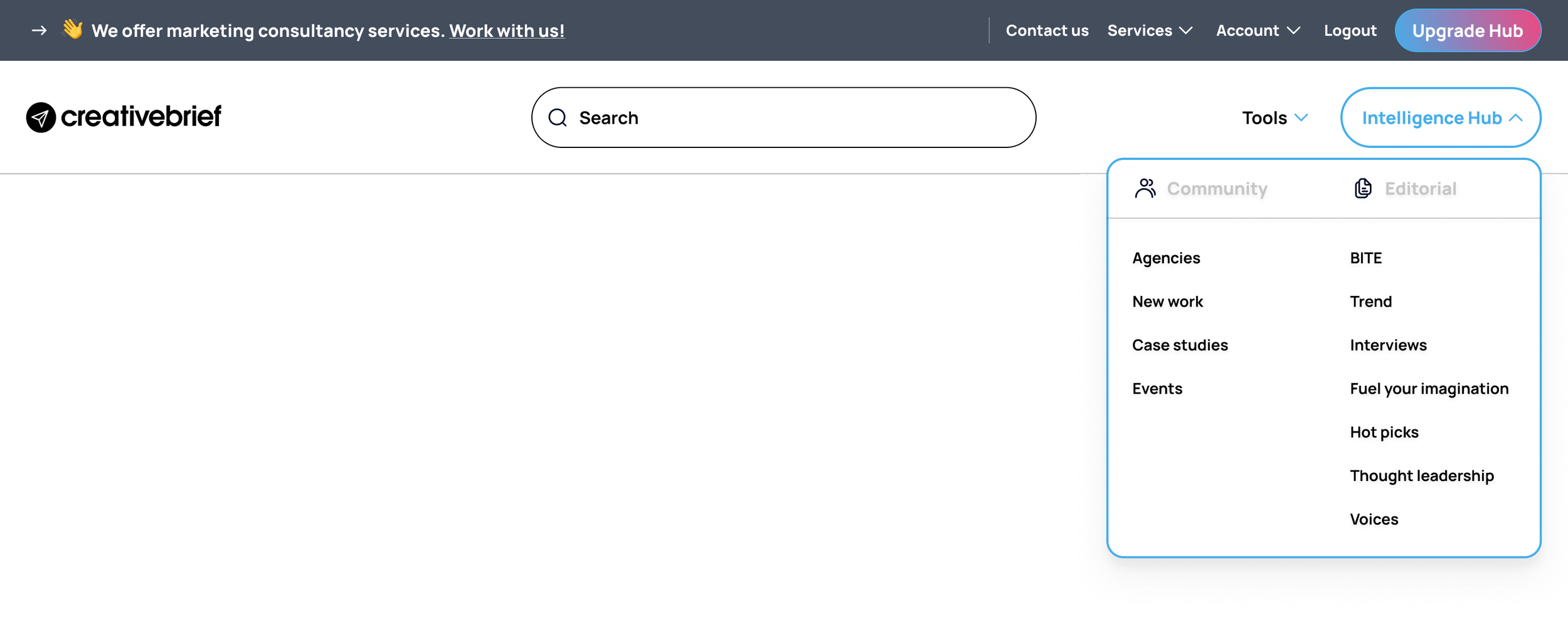
Logged in

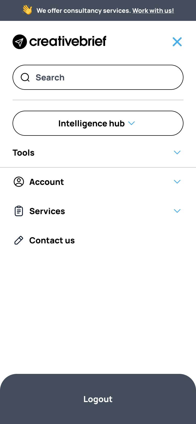
Mobile
Logged out


Logged in (Gated)

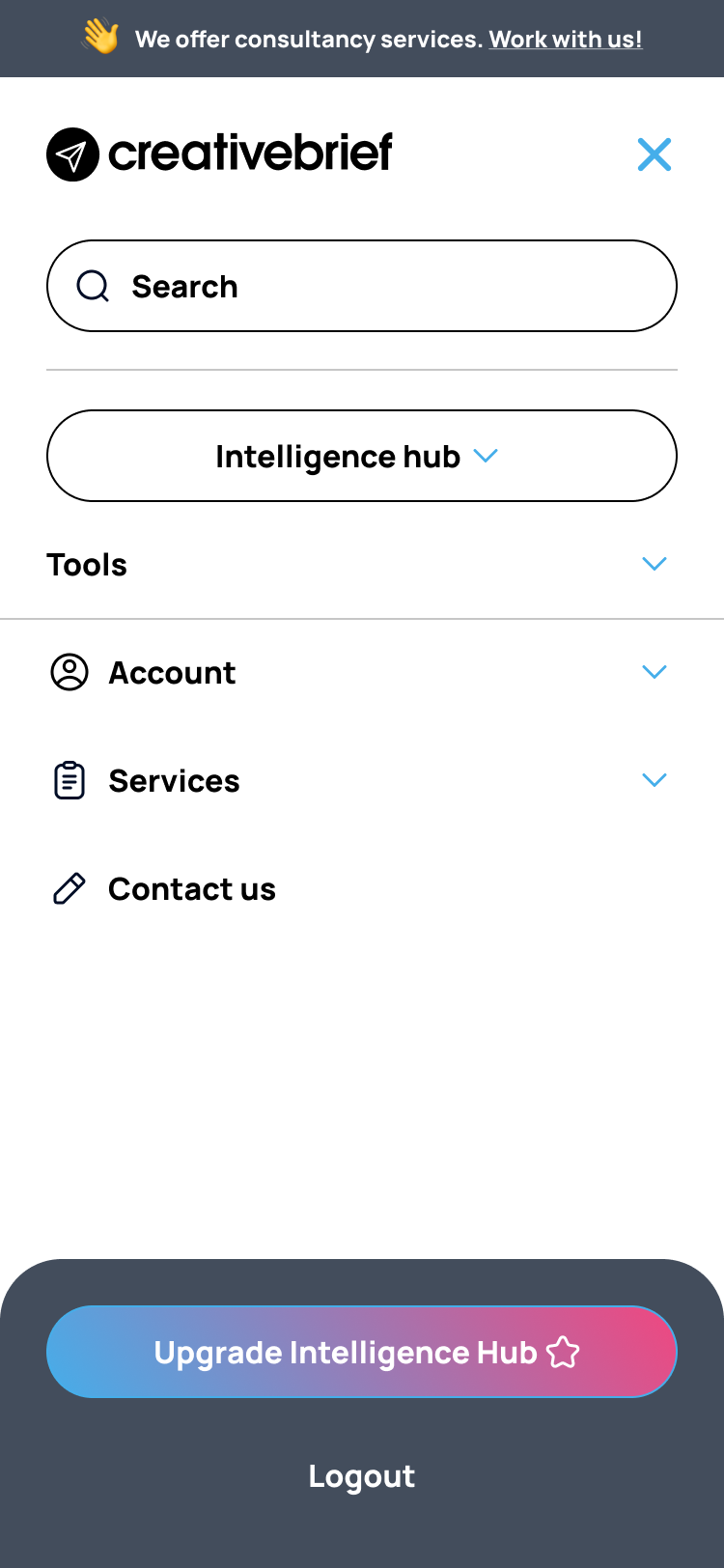
Logged in

Final Results
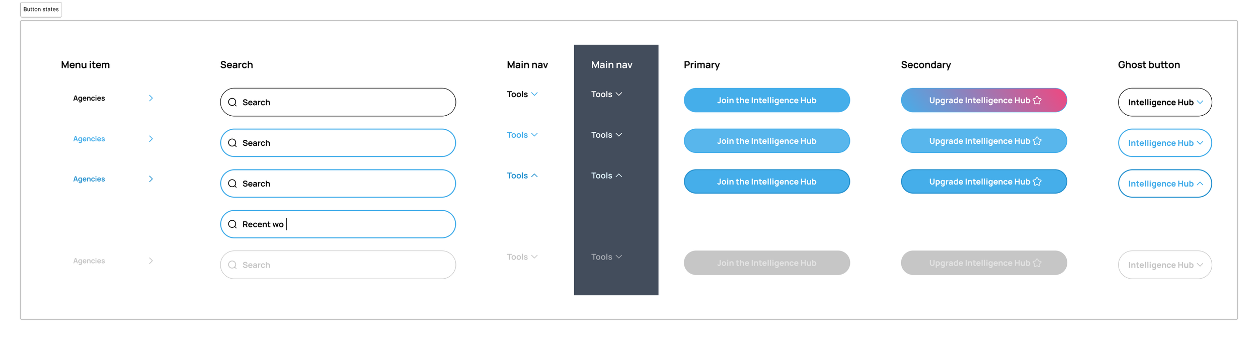
Optimised link count: Limited navigation items to a “magic number” (5–7) to reduce cognitive load and aid quick scanning, including splitting the navigation into two parts. One for the products and one for their service promotion and user account management.
Clean, purpose-driven labels: Created clear, consistent messaging towards a desired key business product and service. For example, from ‘Intelligent insights’ to the ‘Intelligence Hub’ highlights a clear action towards the Creative Brief’s extensive marketing insights product portal.
Responsive layouts:
Desktop: A traditional left-aligned logo, right-aligned navigation, and a standout CTA (“Intelligent hub”) with hover feedback and strong contrast.
Mobile: A sticky, collapsible hamburger menu with labeled icons and sufficient tap area (30–38 px)
Strong visual hierarchy: Maintained top-left logo placement for instant brand recognition (research shows 89% more recall). Improved visibility of main Product and Services CTAs, including subtle and familiar changes for users’ sign-on states.
Accessibility compliance: Text maintained high contrast ratios (WCAG standards), navigation was screen-reader friendly, and tap zones met accessibility sizing guidelines.
Deliverables
Desktop and mobile UX flows.
High-fidelity UI mockups with hover and tap states.
Developer-ready components for rapid implementation.
Lessons Learned
Less is more: Cutting down menu items and using descriptive labels significantly improved scanability and user confidence.
Consistency wins: Users value predictable UI patterns—particularly around logo placement and menu behavior.
Accessibility early pays off: Addressing contrast, structure, and responsive sizing from the start avoided costly retrofits.
Scalable design is smarter: designing with future features in mind (e.g., advanced search or profile integration) saves time in the long run.
Next Steps
A/B test CTA placement and wording: Does “Intelligence Hub” outperform alternatives like “Insight Hub”?
Analytics tracking: Implement heatmaps to visualise user engagement with header elements and refine them based on real data.
Explore feature expansion: Consider adding an advanced search UX or live notifications in the header—designed carefully to preserve simplicity.
Ongoing accessibility audits: Ensure that any future changes maintain compliance and continue to deliver inclusive experiences.