ATP x WTA Joint App
I designed a united Tennis App for both the ATP and WTA tennis associations. I led the UI and UX in close coordination with the Director of Mobile and Web Technologies and developers to craft a distinctive live scores platform for Tennis audiences using Figma.

Goal
To create a mobile app in collaboration between the ATP and WTA tennis associations to establish a unified, user-centric platform that enhances fan engagement and live scores, provides comprehensive access to tennis content and fosters a seamless and enjoyable experience for fans of both men's and women's professional tennis.
This joint effort aims to celebrate the sport, share real-time updates, and create a shared space that reflects the global excitement, inclusivity, and community surrounding tennis whilst being stacked against the current legacy system.
Final result
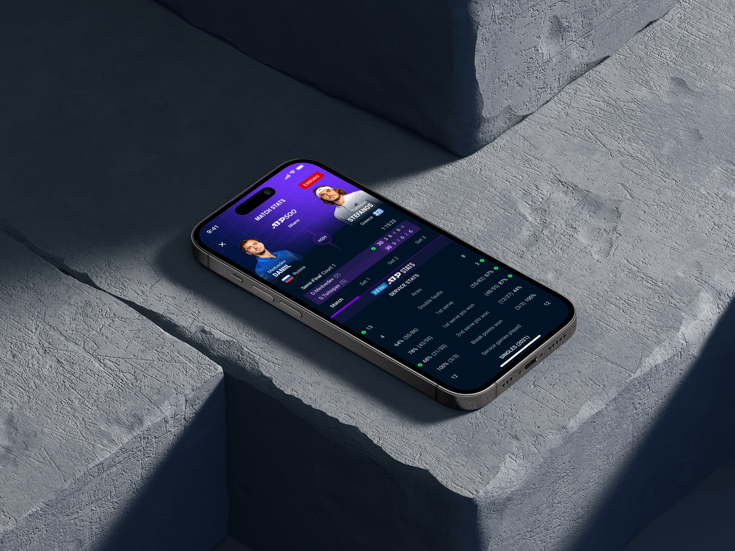
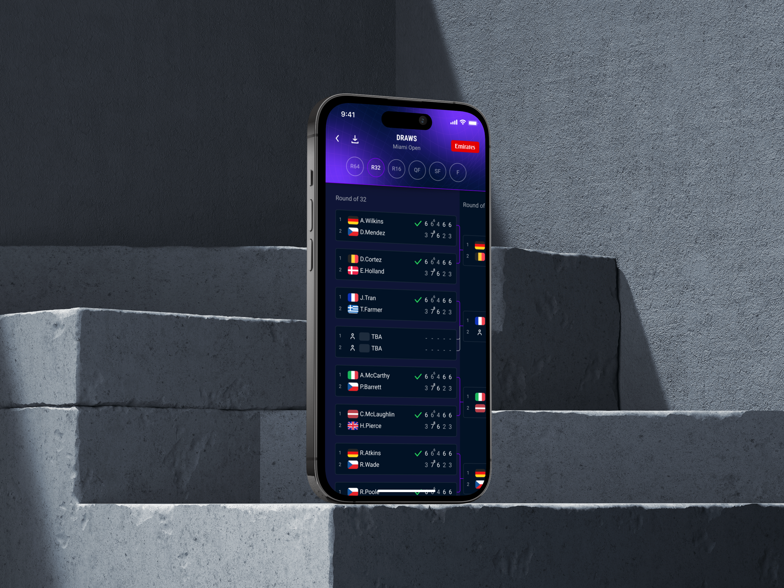
We implemented a performance-first UI/UX strategy, which yielded significant results for phase one of the project. The focus on optimising performance as a priority led to enhanced speed, responsiveness, and overall efficiency in user interactions whilst keeping the legacy formats in place. Users experience quicker load times, an intuitive, simplistic and streamlined component library, smoother navigation, and a more seamless overall aesthetic, contributing to a positive and high-performing user experience.
Deliverables
Component and pattern UX research
UI Inventory
UX Audit
UI design
QA of implementation
App Design Systems
Joint App design
Lessons learnt
Implementing a performance-led UI and UX over aesthetic design taught us invaluable lessons. Prioritising performance enhanced overall user experience by improving speed and responsiveness. Focusing on functionality and efficiency contributes more significantly to user satisfaction than purely aesthetic considerations, and expectations must be managed, especially during a phased approach. This approach underscores the importance of balancing visual appeal with optimised performance for a more impactful and user-centric design to suit business and user needs.
Next steps
Fro phase two we should improve personalisation to enhance fan engagement and user satisfaction. Also with an anticipated rebrand and for leeway for UX R & D we can foster better brand loyalty and increase retention by tailoring content and sponsored features to individual preferences. We should also upgrade the design system to adhere to the overarching core design system within the ATP product environment.
Wireframes
I created numerous rounds of low and mid-fidelity wireframes, highlighting the difficulty of keeping essential tasks straightforward and at a single level in the Joint app. This exercise was crucial for identifying the most effective design patterns within the legacy system that would make sense and understanding how users would move between screens.
Iterations and exploration
Visual Research
Researching visuals for our joint app involves exploring the latest design, UI, and UX trends in publishing and sports associations. This ensures our app aligns with current standards, delivering an engaging and intuitive user experience.